A gaming technology client approached us with a request to build a long term online insight community that they could use for ongoing product, marketing, and industry research.
During the development phase of a new support website prototype, our client sought consumer feedback on user interface and design. Based on research objectives, the icanmakeitbetter team conducted a two-part study where community members could interact with and test the webpage concept in real-time. The client would then use the findings to improve and finalize the website.
Objectives included feedback on the following areas:
- Overall design
- Aesthetic look and feel
- Structure and navigation
- Areas of improvements
- Additional desired resources and features
- Likelihood to recommend and use


AUDIENCE
Gaming Insight Community
OVERVIEW
The icanmakeitbetter team took a mixed-mode approach to obtain both quantitative and qualitative feedback on the website prototype. Part one included an online survey conducted amongst the entire community. A sub-set of the respondents were then invited to participate in part two, which involved a 60-minute live chat session.
Online, Quantitative Survey
At the time of the study, the online community consisted of 444 PC gaming consumers, ages 18+, residing in the US, China, and Europe. Members had been previously recruited, screened, and vetted through a triple opt-in process and had been in the community for nearly a year.
All community members were invited to participate in the survey, which collected 143 completes while in field for five days.
Online, Qualitative Live Chat
At the end of the survey, respondents were presented with the opportunity to provide additional feedback in a deep-dive live chat session. Thirty-one individuals were hand selected and invited to participate based on their interest, past participation, and level of engagement in the community.
Nineteen of the 31 respondents attended the full 60-minute live chat, which was held a week after the survey launched.
ACTIVITY SPOTLIGHT
The gaming industry is booming due to people staying home more because of the COVID-19 pandemic. Experts see the gaming industry reaching revenue in excess of $196 billion in 2022. Cloud gaming is transforming the PC gaming world, as gamers no longer require expensive hardware that was once needed to accommodate PC games. Developers are also creating more remakes and reboots of older video games.
Game creation is no longer a one-way street. Just like anything in business, producers have to create a connection with consumers.
APPROACH & METHODOLOGY
PART ONE: ONLINE, QUANTITATIVE SURVEY
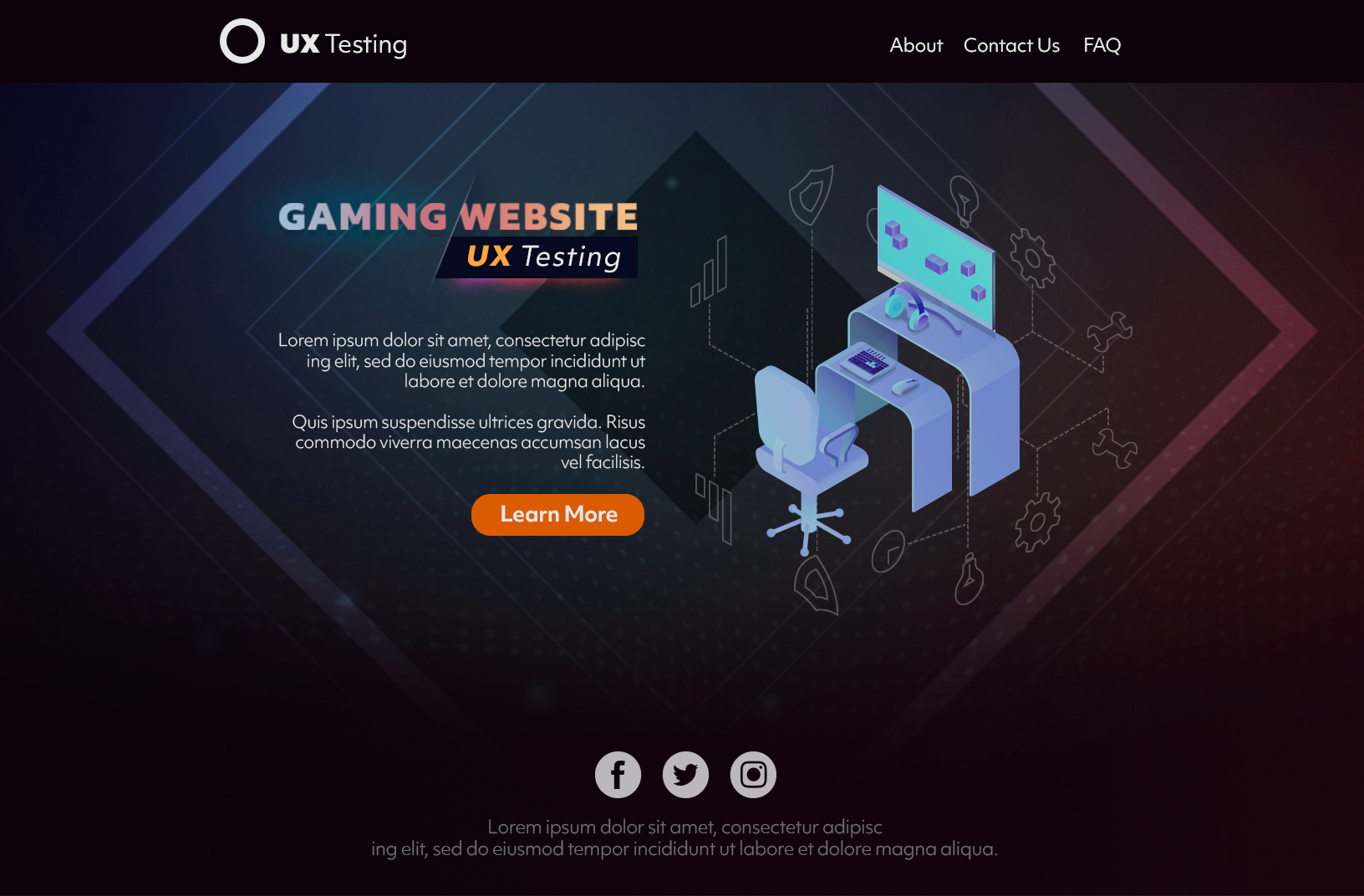
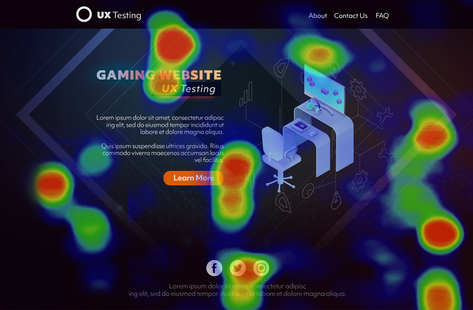
The study kicked-off with an online survey including two heatmap questions. The survey respondents, 143 in total, placed pins on what they liked and disliked about the webpage concept and provided open-ended feedback on why they liked or disliked that portion of the website.
Likes included features such as support videos, useful resource links,
and the overall look and feel of the site.
Drag the arrow to reveal

Easily Digestible

Eye Catching Design

Helpful Support Videos

Needs More Interesting Topics

Difficult to Read Fonts
PART TWO: ONLINE, QUALITATIVE LIVE CHAT
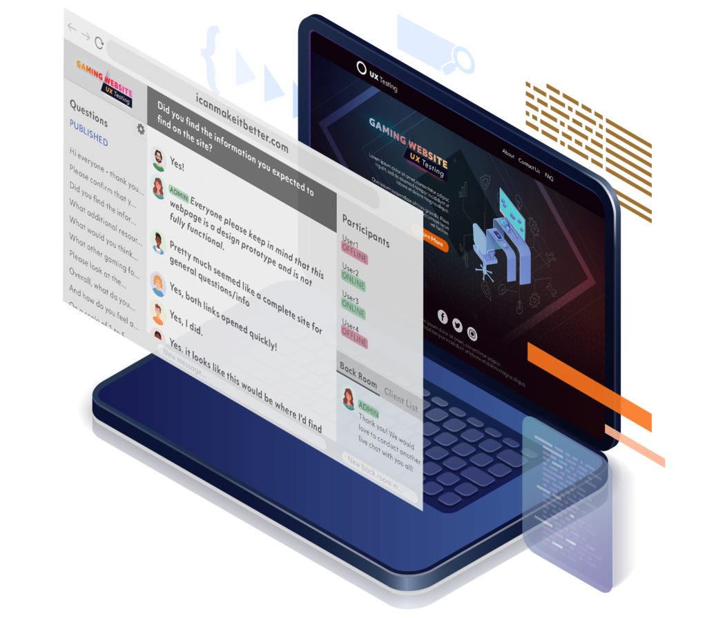
The online survey was followed up with a 60-minute live chat conducted among 19 respondents who were hand selected to participate in the session based upon their engagement in the community and quality of open-ended feedback in past activities. Prior to the chat, respondents opened the website prototype in a separate tab, and were then tasked with various missions throughout the session. The missions involved tasks such as testing features, navigating to certain areas of the website, and searching for specific information on a product.
After completing each mission, respondents returned to the chat and provided feedback on their experience, chatted directly with their fellow respondents, and engaged with a moderator who probed to uncover deeper insights around usability, desired features, overall appeal, and likelihood to recommend.
icanmakeitbetter Community Platform
Mouse-over the icons to reveal the quotes
“It's not bad, but I feel it can be made
more coherent with some design changes.
Right now it feels a bit like everything was thrown
on one page to get as much info there as possible.
Having expanding areas might help this,
where when you clicked to expand you'd see
more in depth info for the specific topic.”
- Female (35-44), USA

A final report of findings was delivered a week following the live chat session. Our client was able to pass along the analysis to their internal UX team, who then used the quantitative and qualitative insights to change, improve, and finalize the design of the website. The webpage launched to the public a couple weeks after the study concluded, which was then announced to members through a community shareback highlighting how their feedback made a difference.
LEARN MORE
About our Case Studies
Autodesk Activity Spotlight
For this particular activity, Autodesk wanted to understand how their Autodesk Advisors were adapting to working from home at the onset of the COVID-19 pandemic.
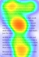
IBM Marketing Case Study
How IBM Leveraged icanmakeitbetter for Early Stage Ad Testing.
Powerful Insight Community Platform
Build a more customer-centric business with our simple, integrated insight community platform.

